

The Jira Project Reporting Academy is back! If you have been following this course, you're closer to learning how to effectively creating reports in Jira and building an organic ways to centralize project data and visualize it with Projectrak (formerly Profields) and eazyBI, especially in this chapter, where you'll learn how to create a Gantt chart for projects.
In this third fascicle of The Jira Project Reporting Academy, we're diving deeper into how to create powerful and useful reports with the integration of Projectrak and eazyBI, if this is too advanced, we'll recommend step back and read first how to set the flow of data from these two useful apps, and after how to create the first project chart, where was explained how to set of three gauge charts from the data in a simple grid, with the following result:
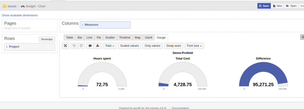
Using this kind of chart, we can quickly understand the project's financial status. Having this in sight, we will be able to act on solid ground and have enough knowledge to build reports that help you track your project portfolio. For example, we can know whether we can add new tasks to a project or whether we should renegotiate the budget with our client first.
But project data is completely flexible: there’s no limit to what you can build! Let’s choose project status as the data baseline to create some interesting reports.
Taking this baseline, note that we’re moving from reports about one project to reports across projects. Depending on how many projects you include, this could be a comparison between disparate projects, a program-level report, or even a portfolio-level report if you have included all your projects.
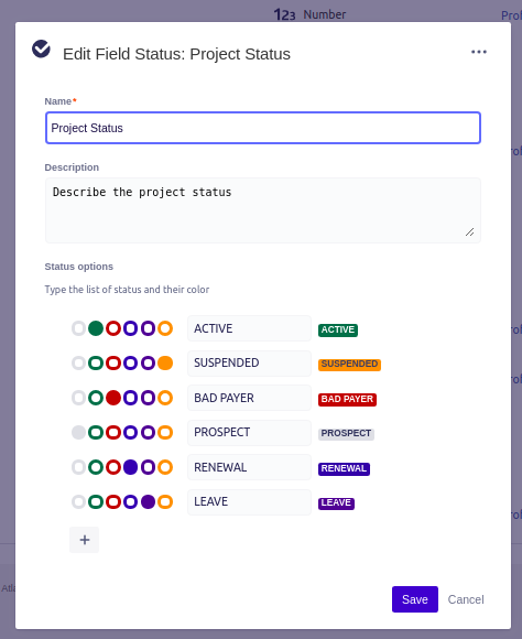
For this purpose, I’m going to define my status taxonomy as follows: ACTIVE, SUSPENDED, CLOSED, BAD PAYER, PROSPECT, RENEWAL. Although I may add new statuses as I encounter new business situations, I will classify all my projects under one and only one of these situations.
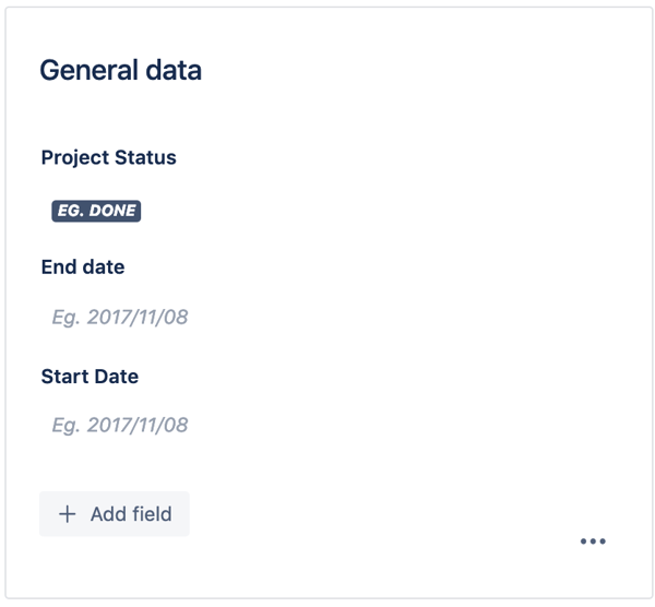
First of all, we define a new Projectrak field to store the project's status:

With these possible options, as shown in the following figure:
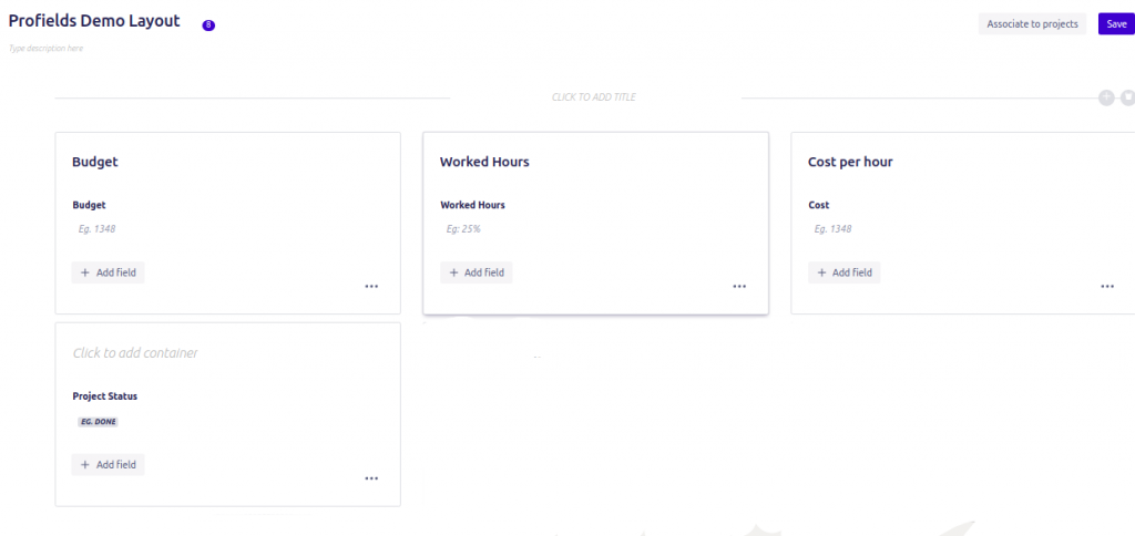
After this, we can add this new field in our project layout, making it available for all projects.
Of course, you’ll then need to implement the field, entering the value needed in each project. Note that you can edit any number of projects with Bulk Operations at the same time!
Next, we switch to eazyBI to modify the import configuration so that it can read the new field as a dimension and property.
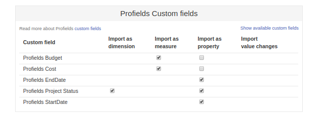
After changing the configuration, I did a new import to load the most recent data. Now, I have values for the new field, which I’ll use to segment the new measures.
On the Analyze TAB, click New Report and follow these steps:
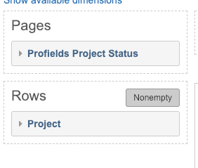
Next, let's select the values for the columns as shown below. In this case, I want to see the Budget.
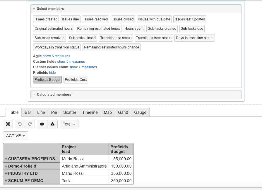
Once data is on a grid, I’m ready to start creating charts. Select the Chart tab and the Pie type to see this final result:
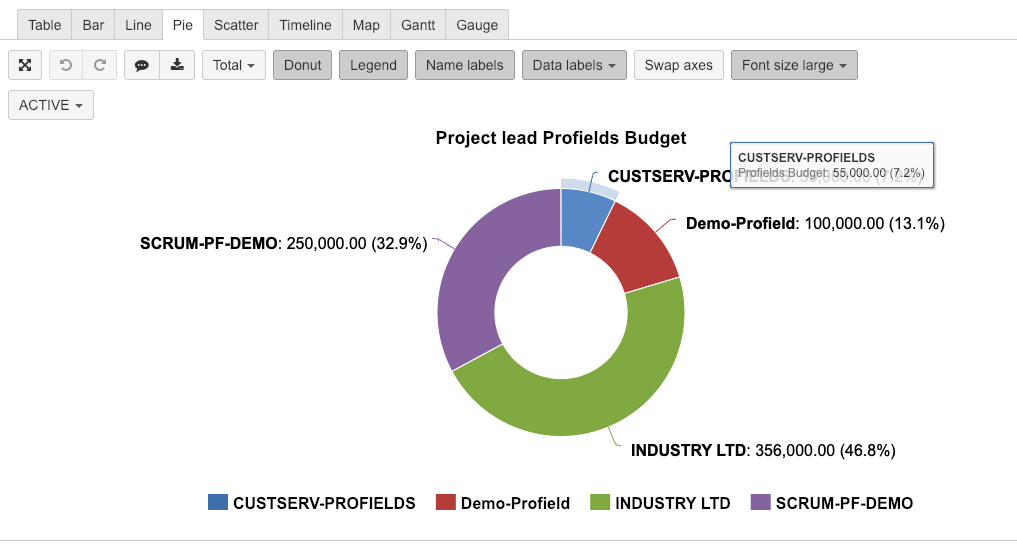
With this chart, I can see projects and their budgets within a given status. For example, the image shows how the budget is distributed among all active projects. Navigating through different statuses is as easy as selecting different options in the dropdown on the upper left.
Using this view, management can easily analyze how the budget is distributed in project status and decide, for example, if it’s necessary to modify budgets for suspended/bad-payer projects.
Now, let’s move to tracking time. It’s a famous limitation that Jira doesn’t have native Gantt charts. One possible solution is to create a Gantt chart with eazyBI to obtain a chronological view of ALL projects.
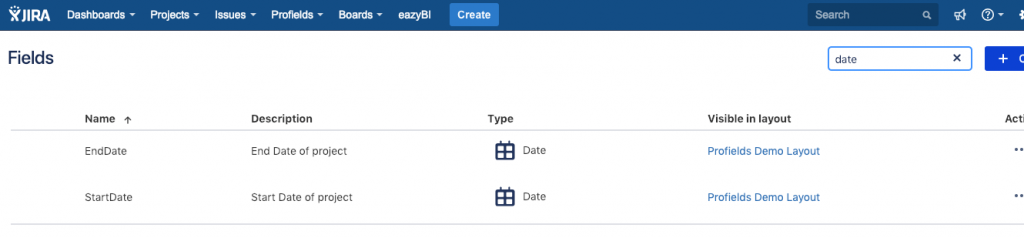
First, we define two new date fields in Projectrak: the start and End dates of Projects.
Now, we can define the Start and End dates of the projects. As usual, we’ll add the new fields to our Project Layout.
Finally, we set the values in those new fields.
When the project metadata has been implemented, we switch once again to the import data configuration in eazyBI. Once dates are set as properties, we can import them and start reporting with the new measures.
On the Analyze TAB, select New Report, with the following measures and dimensions as shown below:
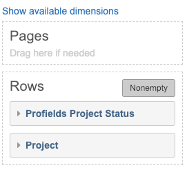
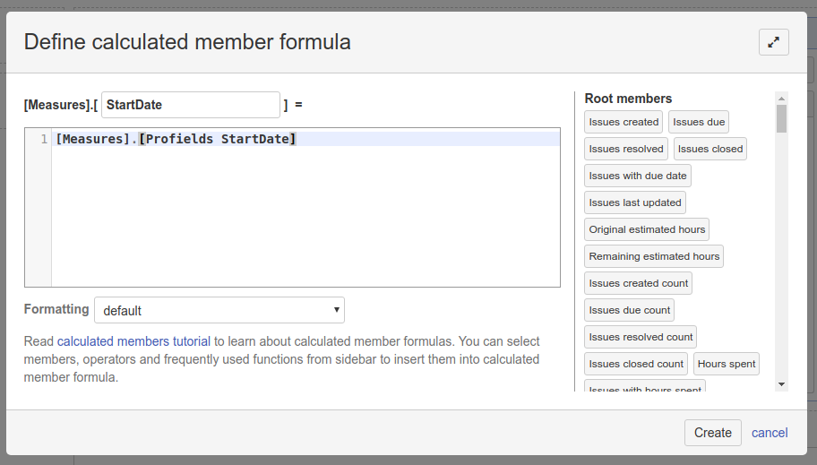
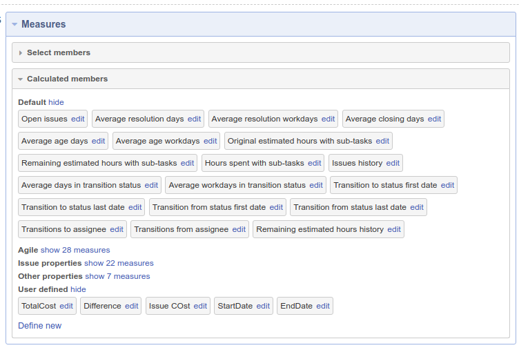
Select the new column values. First, we create a new measure, one for the Start date and one for the End Date:
Then, we select them to define the new columns
This is the resulting grid: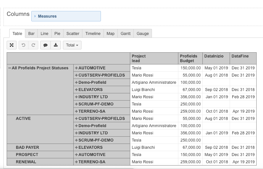
The last step is to go to the GANTT TAB to automatically read the grid data as a Gantt:
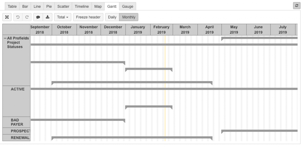
This report gives managers an overview of the projects and can better manage new projects, identifying when they can be scheduled without interfering with other projects.
As a bonus step, I want to show how we can embellish the multi-project Gantt chart above, adding important information that tells us how each project is going.
For this example, I have chosen budget as the dimension that will be tracked. Let’s see the trick!
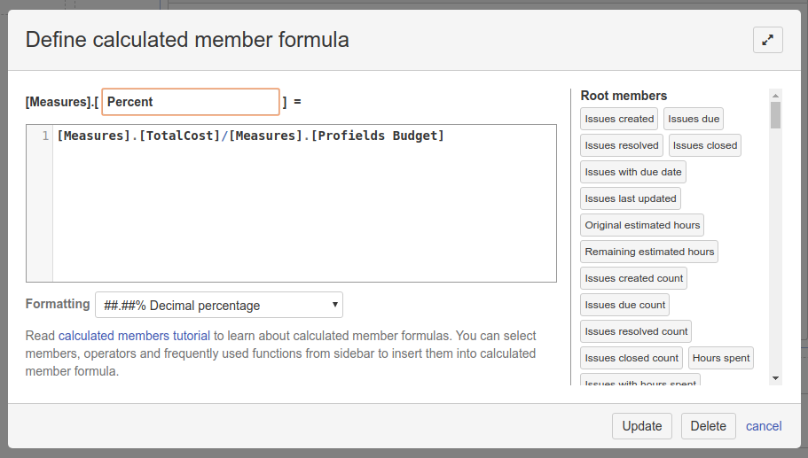
Let’s jump right into eazyBI to create a new calculated measure that will give me the percentage of the budget spent:
Next, let’s add it to the grid after both date fields. Let’s see the visual output. This is a big "a-hah" moment!
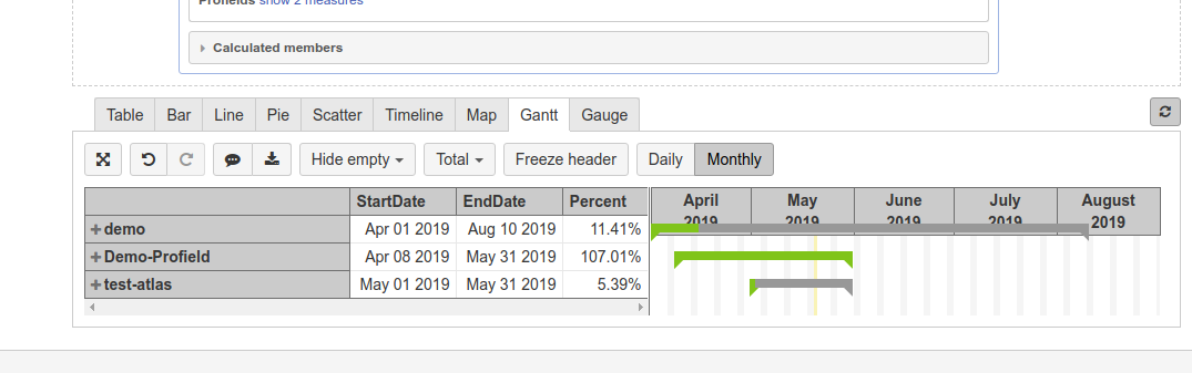
eazyBI interprets the percentage value and displays it using colors.
In the final lesson of the Jira Project Reporting Academy, we will show how to combine all the reports we have built into a comprehensive dashboard with vital information for a Project Manager. Stay tuned!


No Comments Yet
Let us know what you think