

The Jira Project Reporting Academy is a series of articles that will show how to build a dashboard of project reports in Jira using the integration between eazyBI and Projectrak (formerly Profields); in this post, we'll explain how to generate charts and diagrams combining data from Jira projects.
In the first article of the Jira Project Reporting Academy, we introduced eazyBI and Projectrak and explained how to keep the budget of a project permanently under control, now, this lesson will show how to generate charts and diagrams combining data from both Jira and Projectrak for powerful insights, and the next remaining articles, we'll show how to create powerful and memorable visualizations, and how to build reports that help you track your project portfolio. Let's start!
Remember how, in the previous step, I had created a grid with the essential data that I, as Project Manager, need in order to keep the budget of my Jira project under control:
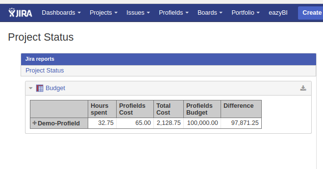 With this grid, it’s really simple to see:
However, a grid is a cold, not-cool way to show the information, and it only takes some additional work to create a visualization that’s much more interesting—particularly if you’re interested in keeping your client informed!
A grid allows us to read and interpret the actual data, but a chart is much more effective: it allows us to understand the situation without any doubt and without any effort of interpretation. It’s also much easier to remember!
The use of colors and the automatic comparison of values in a chart that our brain does when processing the image allow us to glance at things and understand if they are working out as they should.
The objective is then to transform the grid into a Gauge chart, a specific chart that allows you to combine actual measures with a projected total and visualize the result at a glance.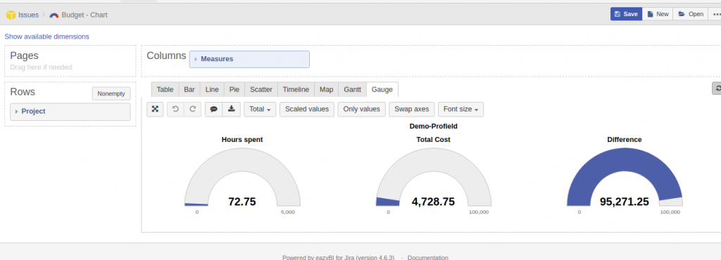
I love this diagram because it gives both value and reference: I can immediately read the hours spent vs. the remaining hours, the budget used compared with the estimated budget, and a last comparison with the estimated hours versus the hours already used. All these comparisons allow me to determine if the situation is OK or whether I have to start taking action to drive the project back on the right track.
Starting from the previous grid, select the Gauge Tab to transform the grid in your first chart.
After this step, I still have to combine pairs of values in order to visualize the relationship between the current and the maximum.
Hovering over the Hours spent Gauge chart, doing right click displays a drop-down where it can be set the Gauge Limit:
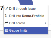
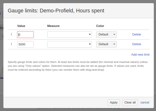
For the hours spent, I’m just setting an abstract benchmark of 5,000 hours that I’m used to seeing in all of my projects. 5,000 hours is about three resources full-time for a year, so this gauge is pretty much about having a bird' s-eye view of how much commitment this project is taking. I certainly don’t want to exceed a lower limit before the project is over, but you can set any limit that works better for you.
Once the upper limit is there, I’ll be able to see how hours spent increase.
Right after that, I’ll move to the next gauge, right-click, and select it again, this time the Gauge Limit. Only this time, the limit is the budget stored in Projectrak.
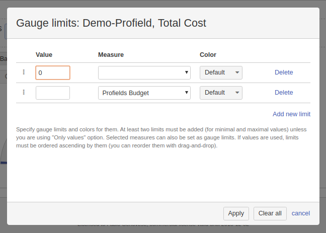
A very important feature of eazyBI is the ability to decide exactly which two data points to compare. In this case, we’re comparing two Projectrak fields: the cumulative cost, which adds the cost of every issue in the project to the budget we manually set at the outset.
I can also set it in the opposite direction to show the remaining budget. Note that the configuration options are identical to those of the gauge above, but my original data point is the difference between the budget and the current cost.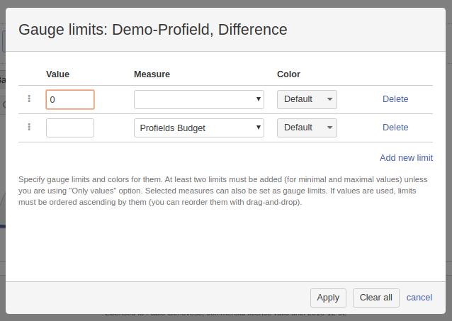
Here is the result! Impressive, right?
Point of attention: In this chart, you can see both situations:
Obviously, I have created this double representation of the same information to show how versatile the tool is and how it meets anybody’s needs. You get to choose whether the bottle is half full or half empty!
In the next article of the Jira Projects Reporting Academy, I will show other types of charts that keep building vital reporting pieces towards the Project Manager dashboard. Stay Tuned!


No Comments Yet
Let us know what you think